Art has the incredible power to evoke emotions, tell stories, and express ideas. But behind every art print, there's a complex process that involves careful consideration of color and composition in art prints. Understanding these elements can deepen appreciation and enhance the artwork's impact on viewers.
Table of Contents
- The Role of Color in Art Prints
- The Importance of Composition
- Achieving Balance and Harmony
- Case Studies: Color and Composition in Action
- Conclusion
- Frequently Asked Questions
The Role of Color in Art Prints
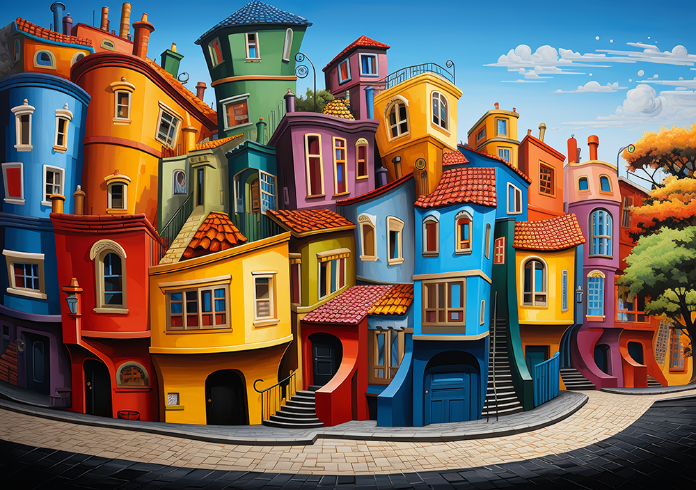
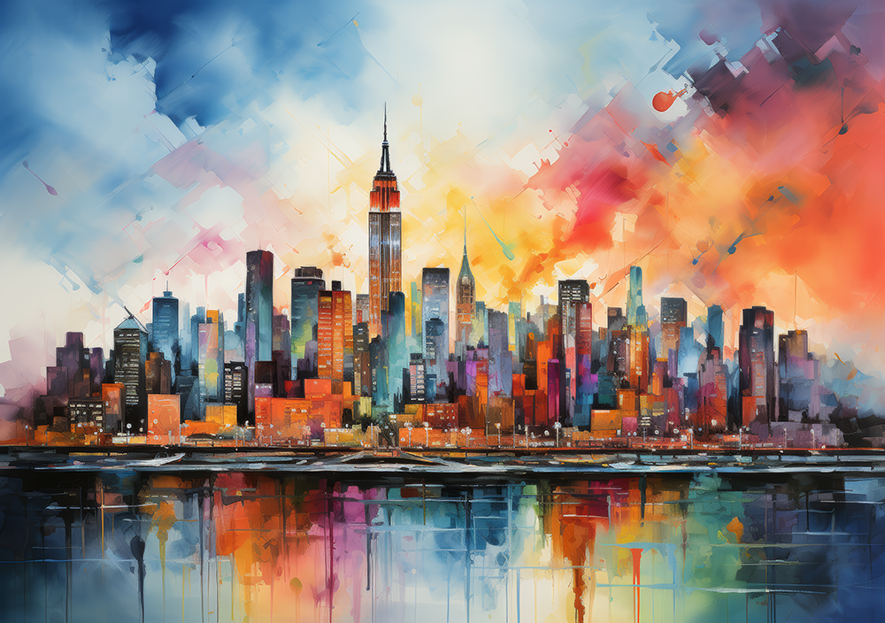
Color holds immense significance in art. It can set the mood, create depth, and influence perceptions. Artists choose colors not just for their beauty but for their emotional resonance. For example, warm colors like red and orange can evoke feelings of warmth and excitement, while cooler colors like blue and green might foster calmness and tranquility.
Psychological Impact
Different colors have psychological effects that can influence the viewer's interpretation. A dynamic red may provoke a strong reaction, suggesting passion or anger, while a soft blue might convey serenity and peace. Therefore, understanding the color wheel and the relationships between colors—like complementary and analogous colors—can enhance the effectiveness of art compositions.
The Importance of Composition
Composition refers to the arrangement of visual elements within an artwork. A well-composed piece guides the viewer's eye and creates a narrative within the artwork. Artists employ techniques such as the rule of thirds, leading lines, and framing to achieve a compelling composition.
Techniques for Effective Composition
- Rule of Thirds: This technique splits an image into thirds, both horizontally and vertically. Placing key elements along these lines or at their intersections can create a more balanced and engaging artwork.
- Leading Lines: Lines that lead the viewer’s eye through the artwork can create movement and focus. This technique often incorporates roads, rivers, or natural lines found in nature.
- Framing: Using elements within the artwork to frame the subject can help draw attention to important areas and enhance depth.
Achieving Balance and Harmony
Balance and harmony are essential in creating aesthetically pleasing art prints. These concepts can be explicit through symmetrical arrangements or more dynamic in asymmetrical compositions.
Creating Visual Balance
Symmetrical balance offers a sense of formality and stability, while asymmetrical balance can generate interest and movement. Achieving harmony involves a unified appearance among all elements, allowing the viewer to experience a coherent piece of art.
Case Studies: Color and Composition in Action
Examining notable artworks can illustrate how color and composition work together seamlessly. For instance, consider Starry Night by Vincent van Gogh, where the swirling blues and yellows create an emotional charge, and the composition guides the viewer through the turbulent night sky.
Another example is The Persistence of Memory by Salvador Dalí, where the use of color highlights the surreal quality, and the balanced composition of the melting clocks creates an otherworldly experience.
Conclusion
Color and composition are elements that play a crucial role in art print production. Understanding how these factors influence the creation and perception of art can enrich one’s enjoyment and appreciation of the artwork. So, the next time you encounter an art print, take a moment to consider the colors and the way the composition guides your eye; it may just provide a deeper insight into the arts.
Frequently Asked Questions
What is the significance of color theory in art?
Color theory helps artists understand how colors interact, evoke emotions, and influence the viewer's perception, thus enhancing the communication of their message.
How does composition affect viewer engagement?
A well-composed artwork captivates the viewer's attention, provides structure, and creates a narrative that can enhance emotional engagement with the piece.